As we move closer and closer to our 11th year, we’re delighted to announce our new and improved brand identity and with it, a refreshed logo design!
Our team has been working on this update for quite a while, and since January is often defined by new beginnings, it seemed like the perfect time to make the announcement.
Over the last 10 years, our business has grown and evolved, and we felt it was time for a change. We have refreshed our logo to reflect who we are today and to symbolize our dynamic future.
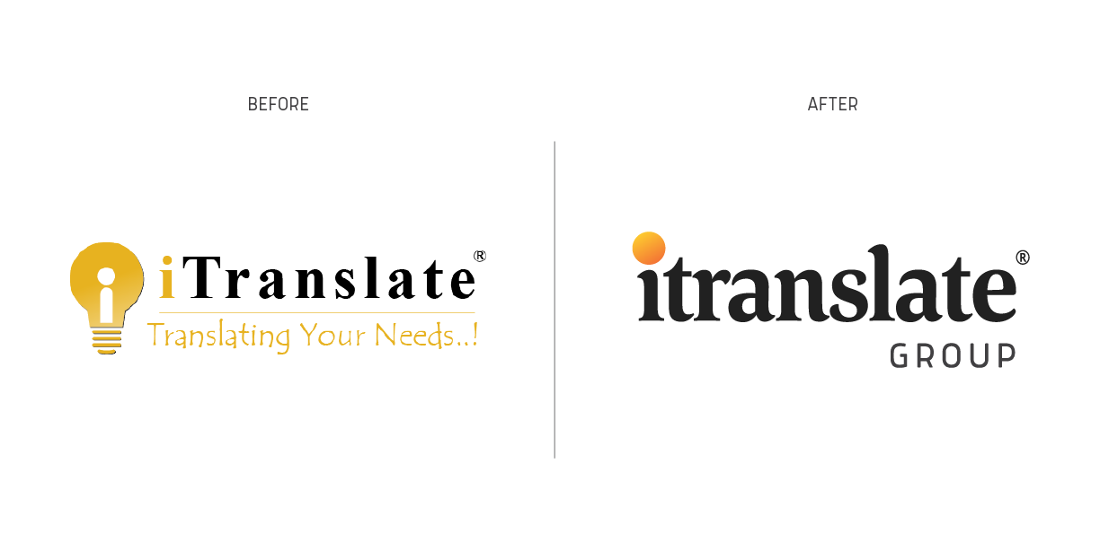
After careful consideration, we chose a new logo that reflects a more modern look and captures our mission to deliver excellent quality by finding bright spots of insights across the services we provide.
As an expression of the innovative and creative solutions that the company creates, the light bulb was selected to pioneer the itranslate brand since launching in 2010.
This updated brand identity puts a modern twist on our previous light bulb icon through a minimal, simple, and clean design.
We have focused on the core concept of light inspiration more comprehensively and abstractly to express broader horizons. Therefore the most noticeable change was the replacement of the light bulb icon with a bright spot of gradient colors with more inspiring colors.
As for typography, it was clear that using a classic serif-typeface was to evoke nostalgia for books and writing, but also you could feel the dullness of the Times New Roman typeface. That was the motivation to adopted a more unique typeface from the same serif family, so we have chosen Corda.
In the upcoming weeks, we will update all our marketing materials and online presence, etc. with the new logo.
If you have used the itranslate logo in any of your marketing materials, please assist us in updating them. We appreciate your kind support. If you have any questions, please don’t hesitate to Contact us.
You can also download the new logo guidelines from here.